Collaborators:
Micaela Sato (Social media, simulations, UX/UI design)
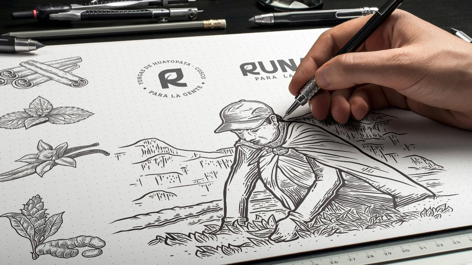
Brandon Ramirez (Illustrations, motion graphics, logo design)
Josie Berrospi (Packaging, creative writing)
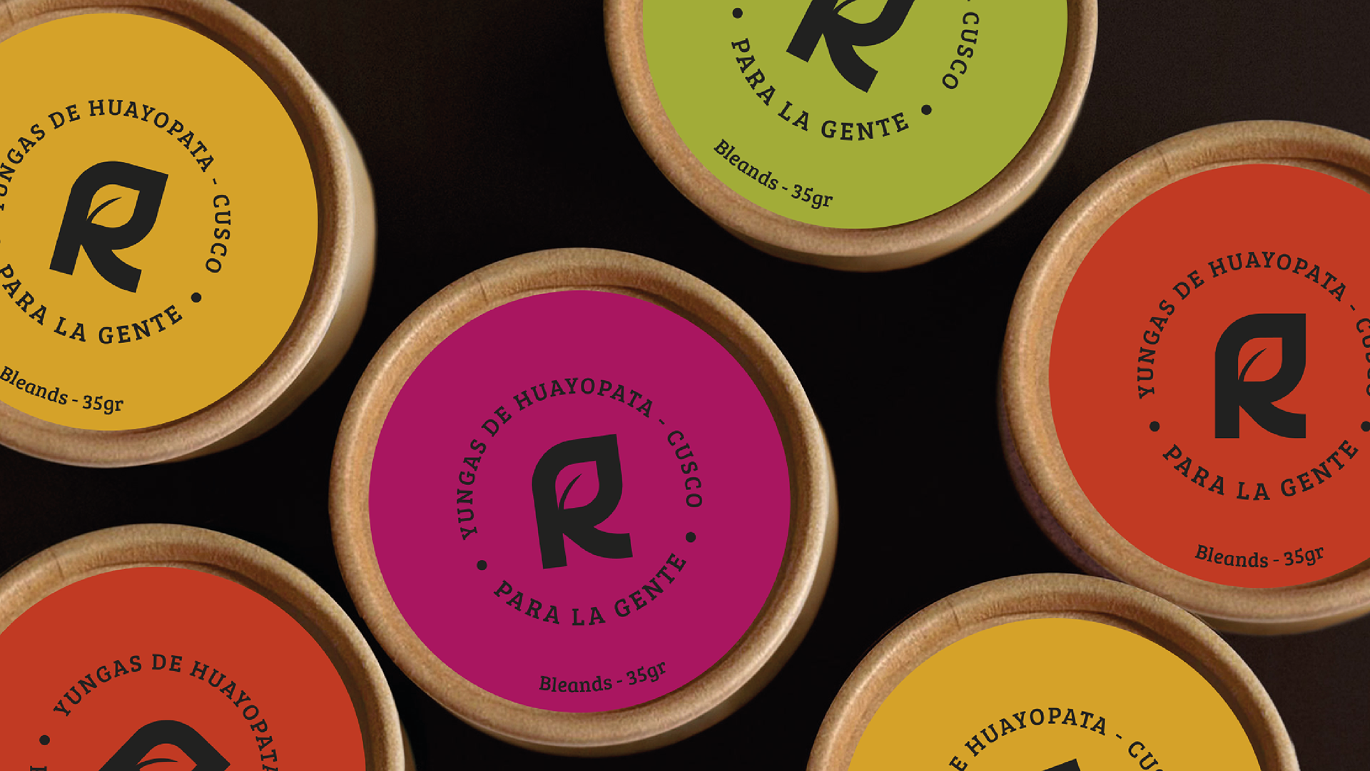
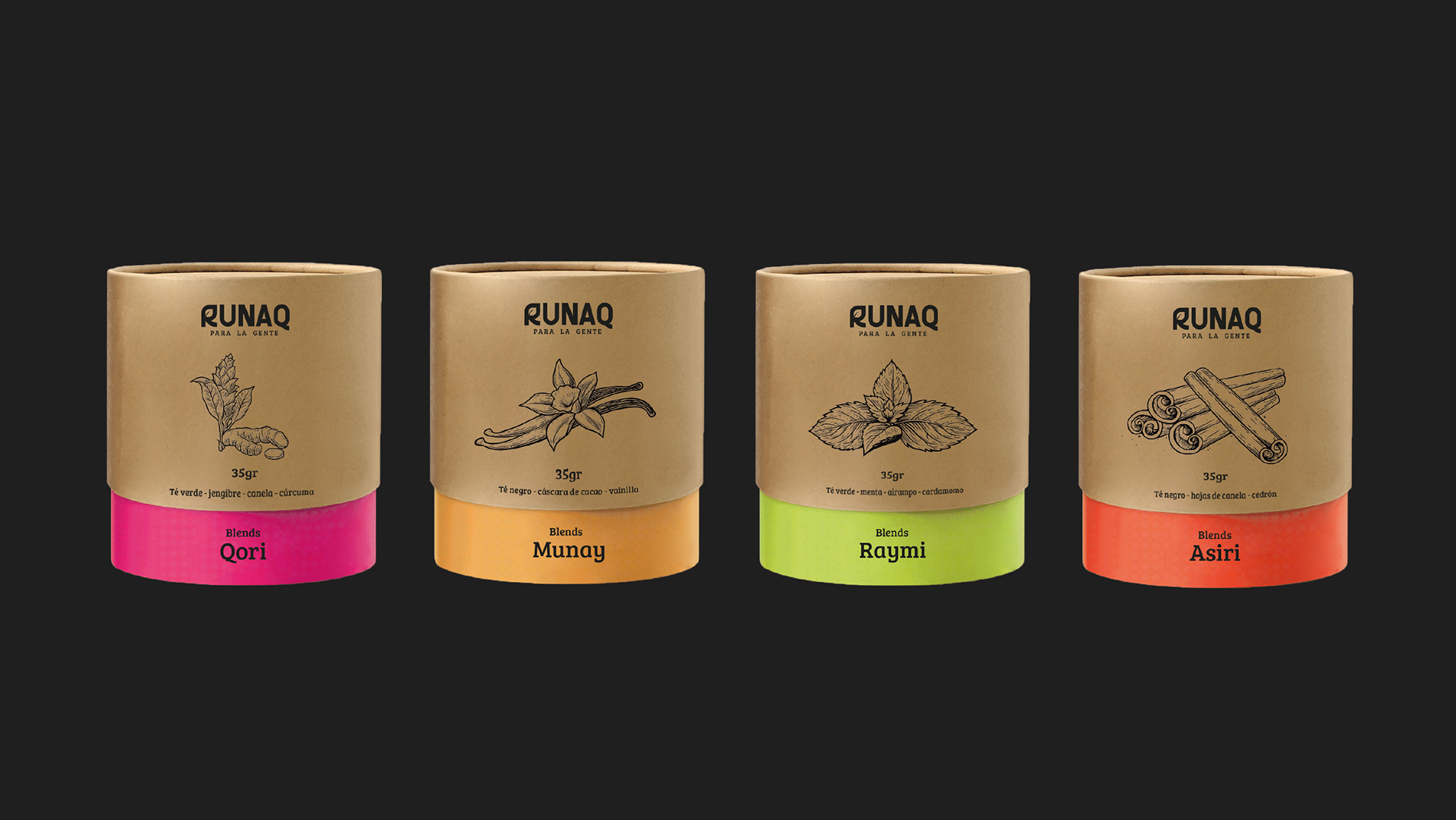
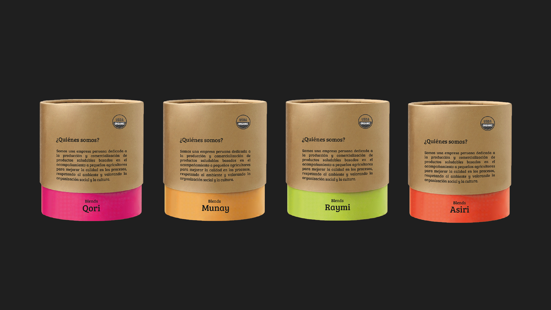
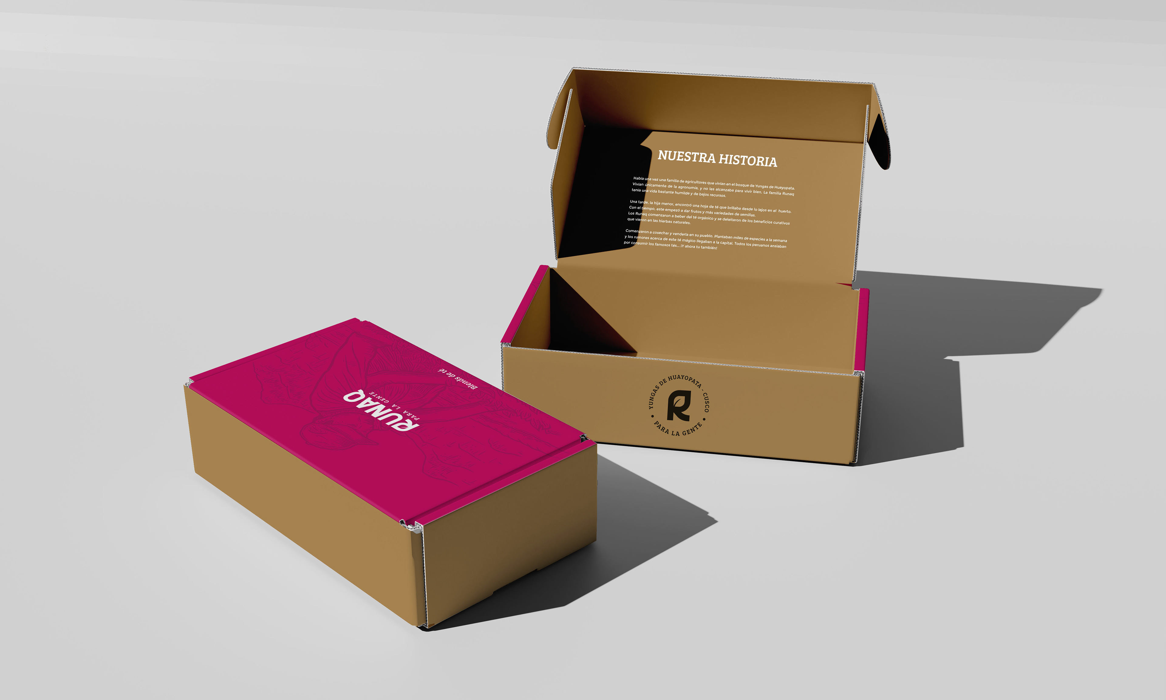
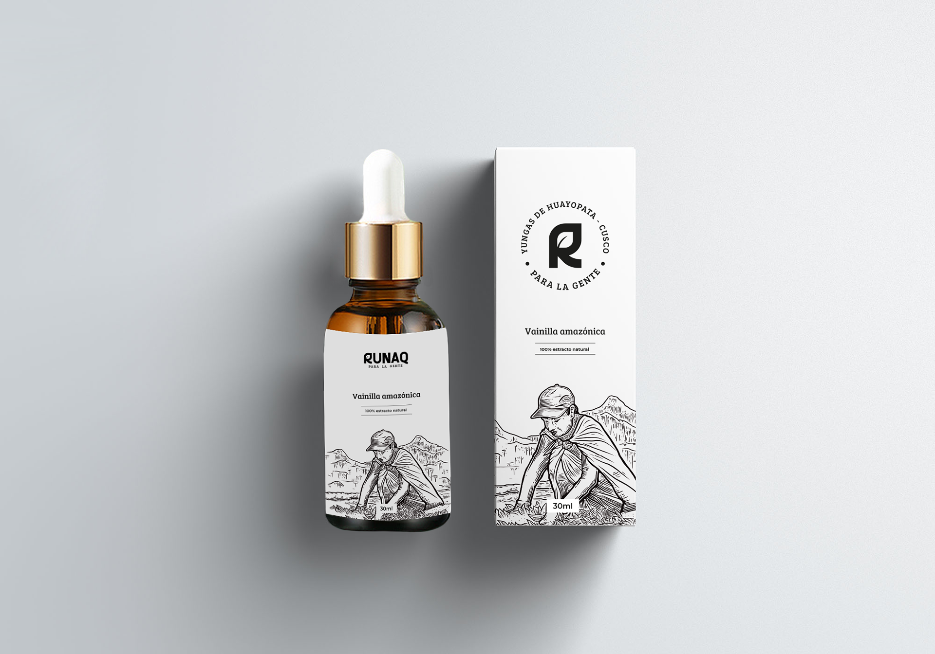
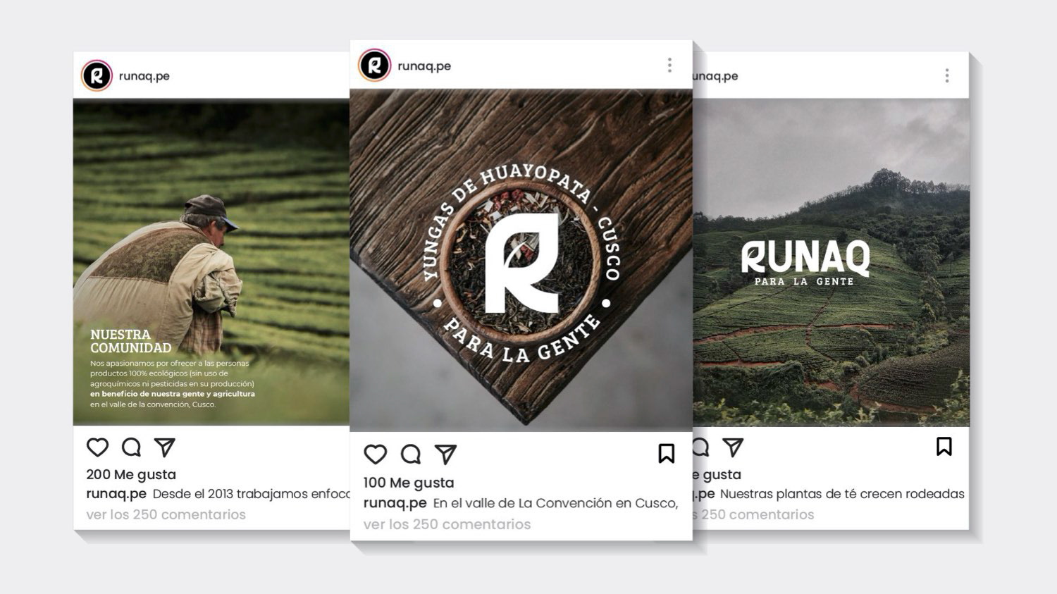
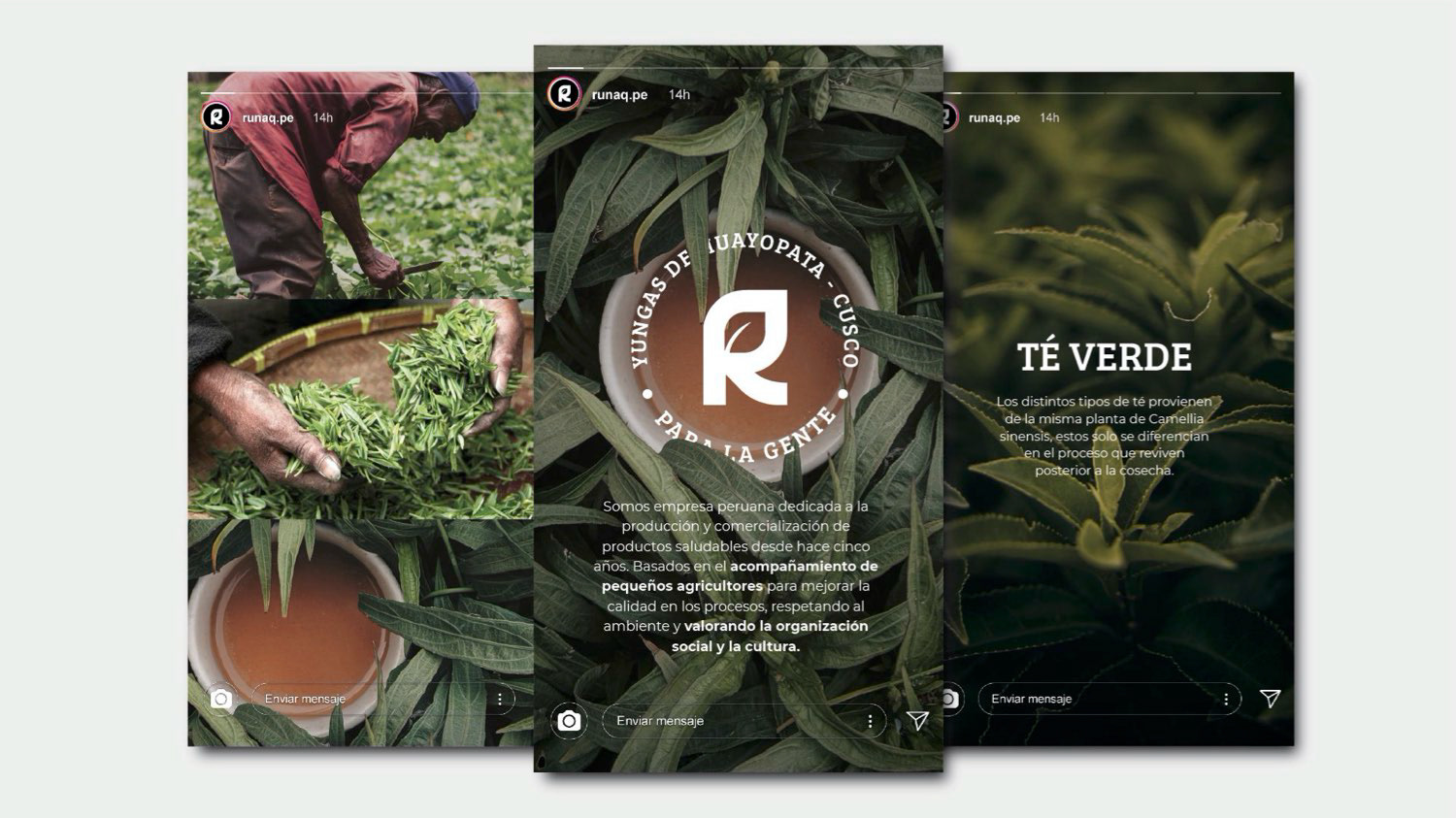
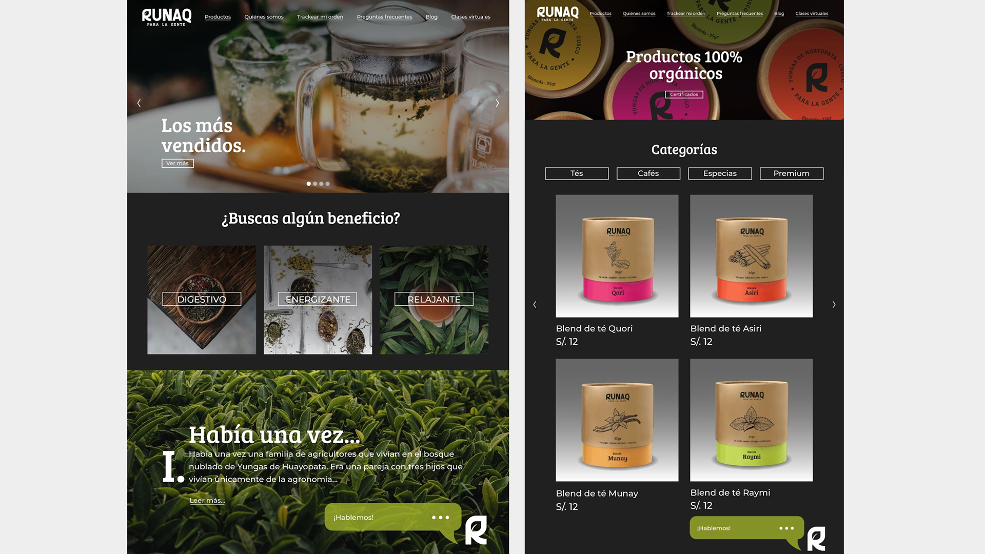
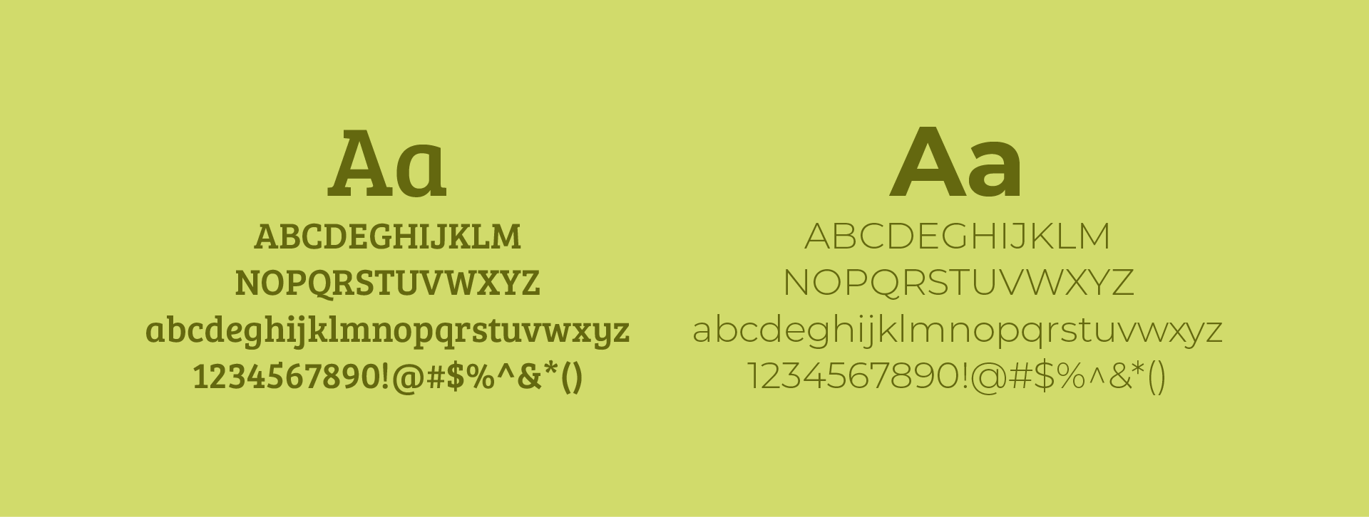
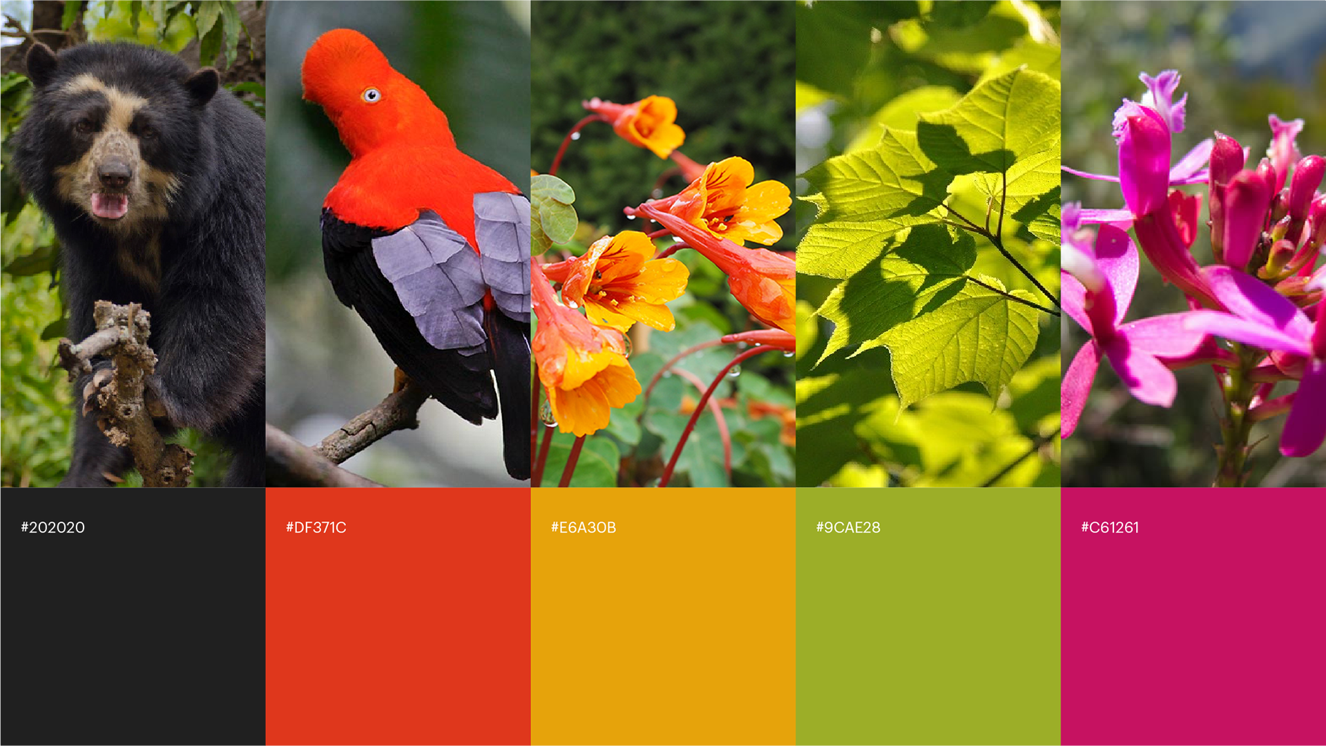
The color palette is inspired by the rich flora and fauna of the Yungas of Huayopata, complemented by a blend of rounded serif and sans serif typography to create a warm and inviting personality.
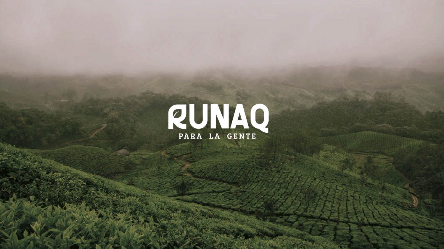
RUNAQ means "for the people" in Quechua (main language of the Inca Empire), which stands for the healthy lifestyle the brand provides for the consumers as well as for the producers.


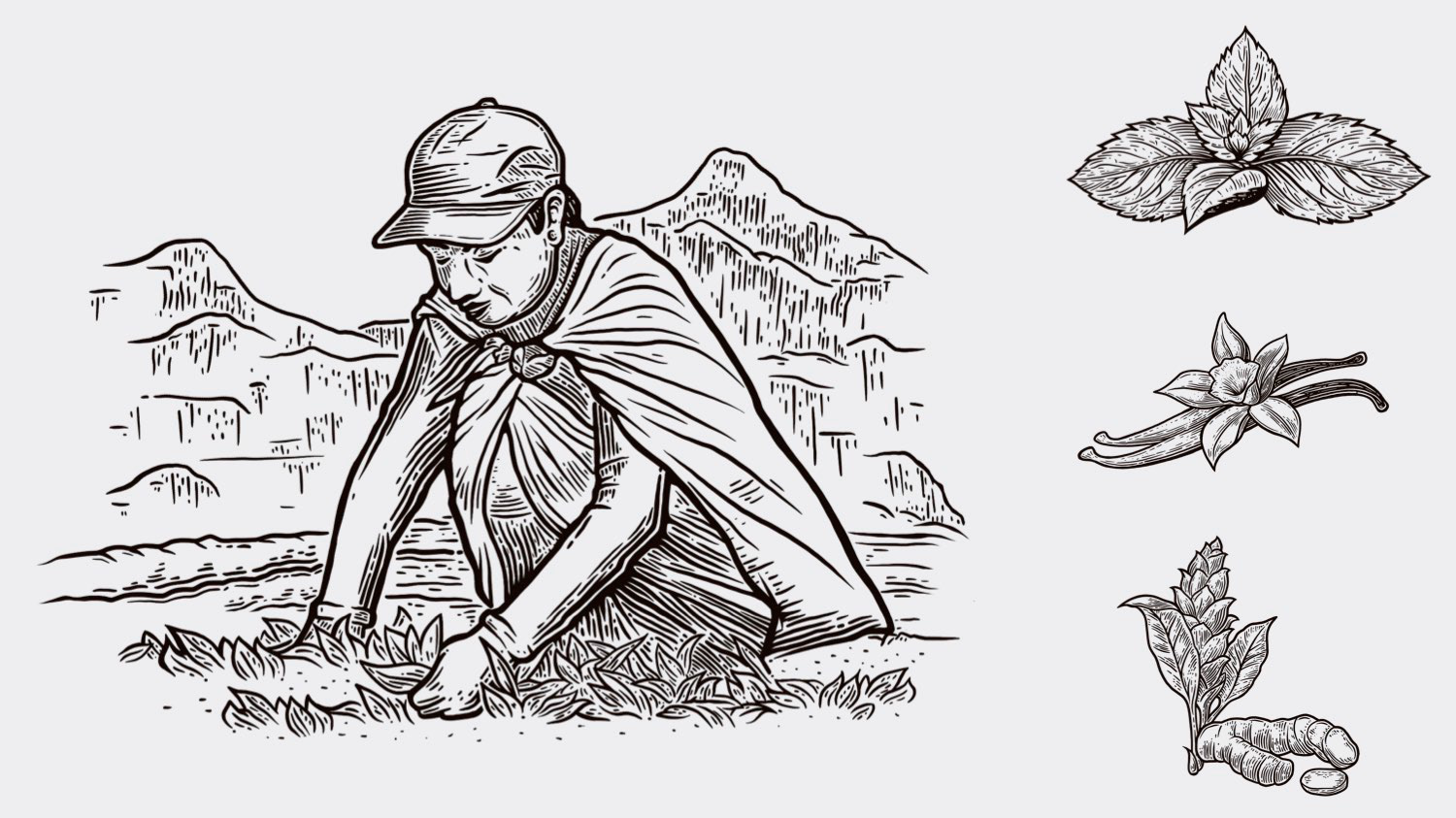
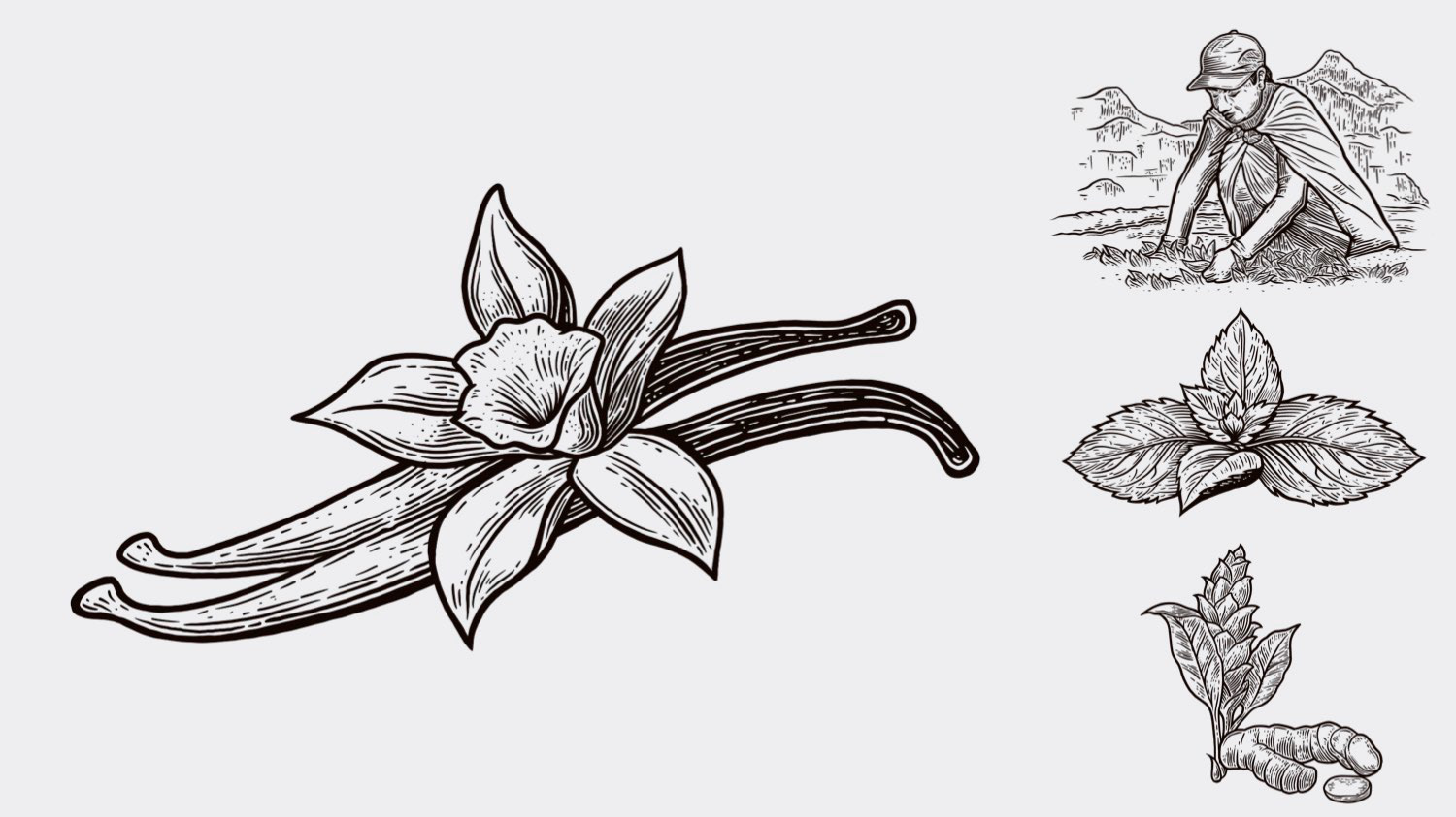
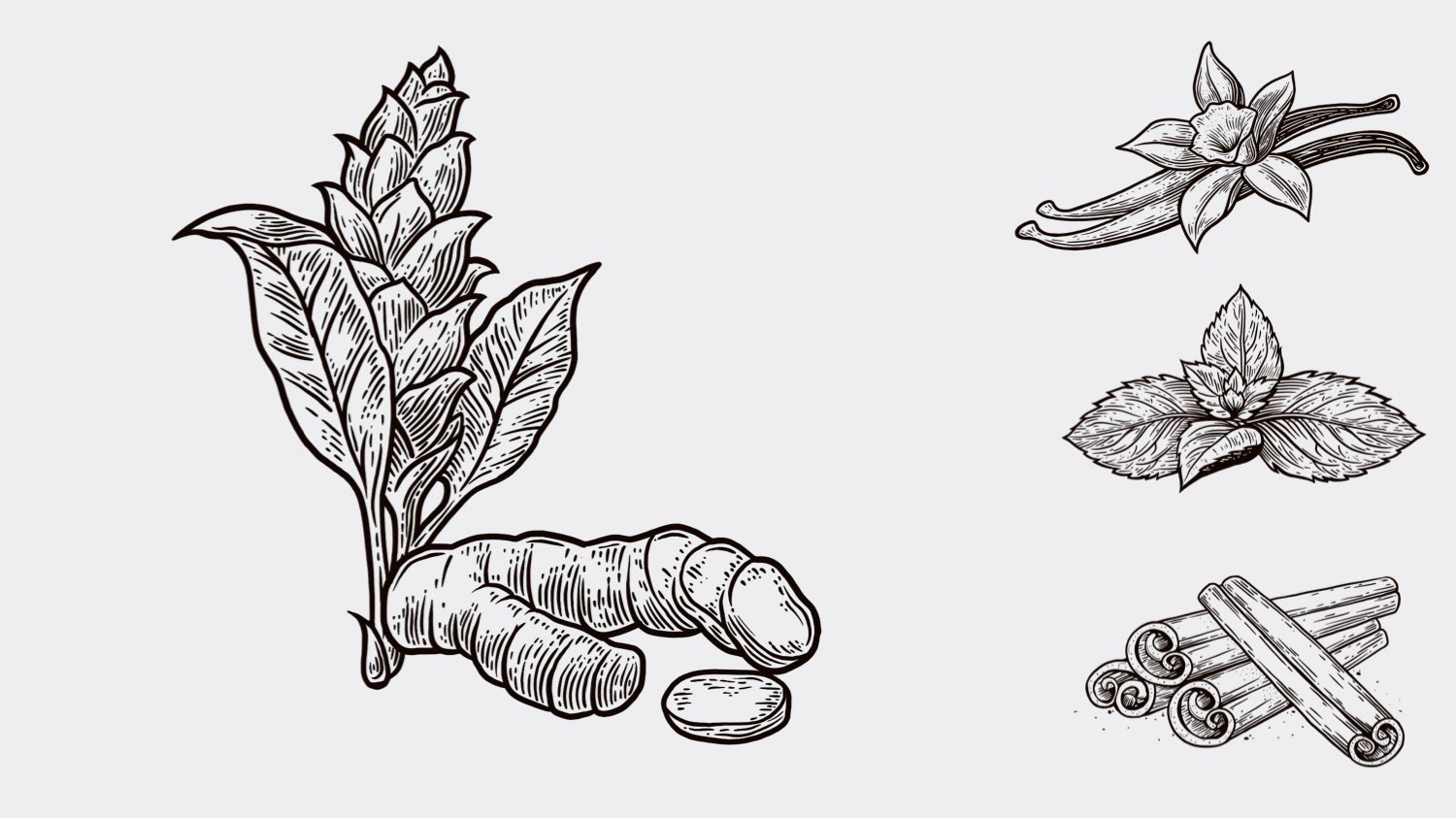
Handmade, detailed illustrations were implemented to capture that organic/imperfect essence that RUNAQ represents, featuring each one of its key ingredients.