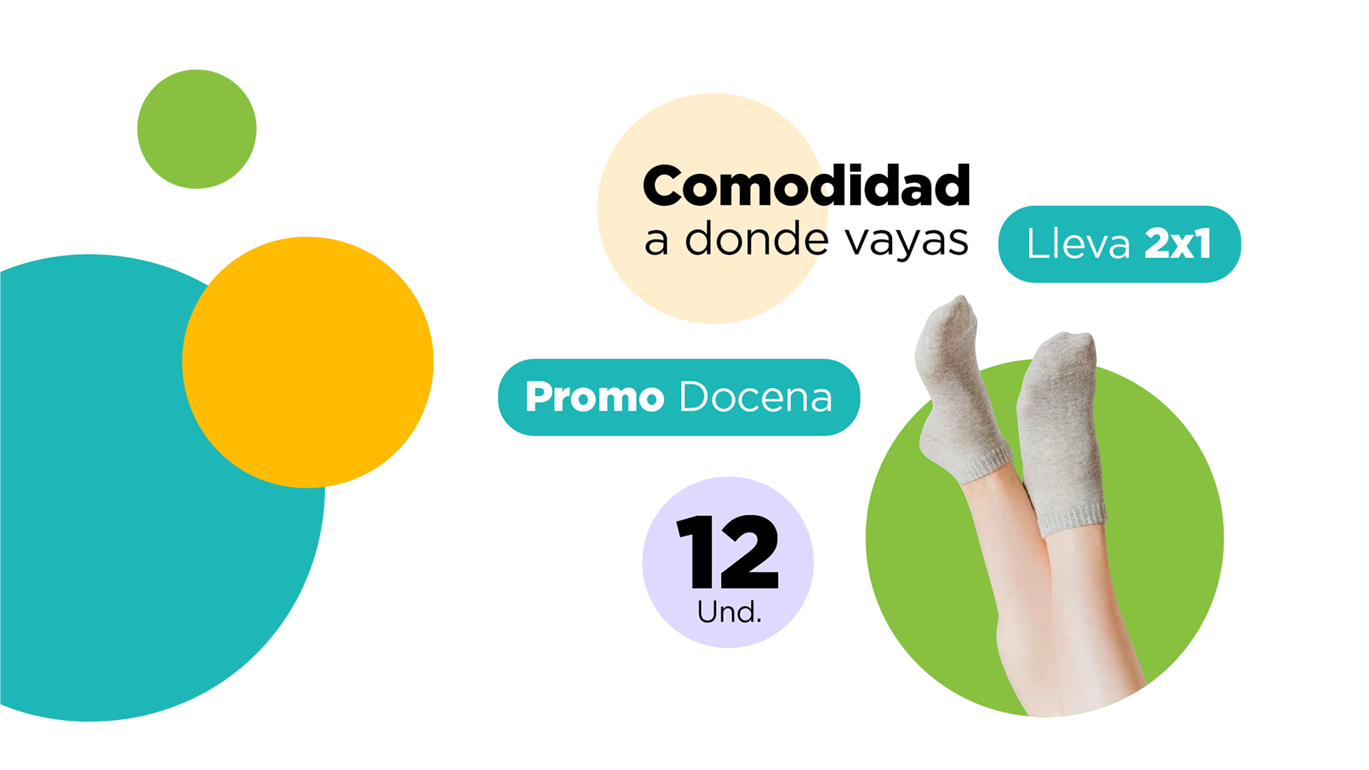
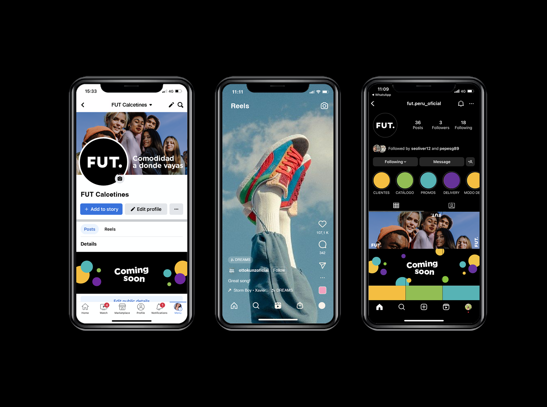
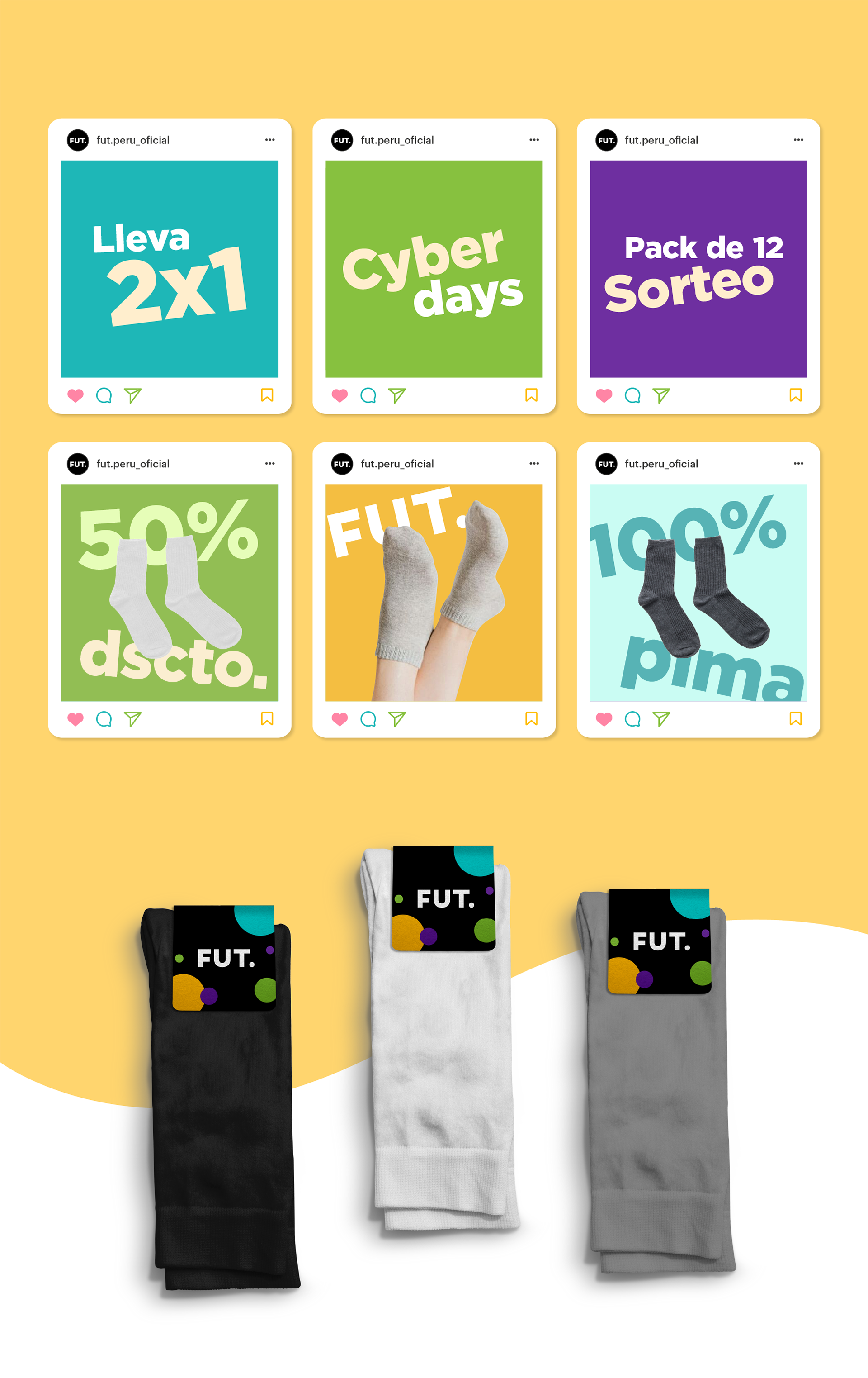
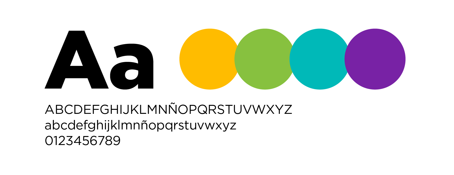
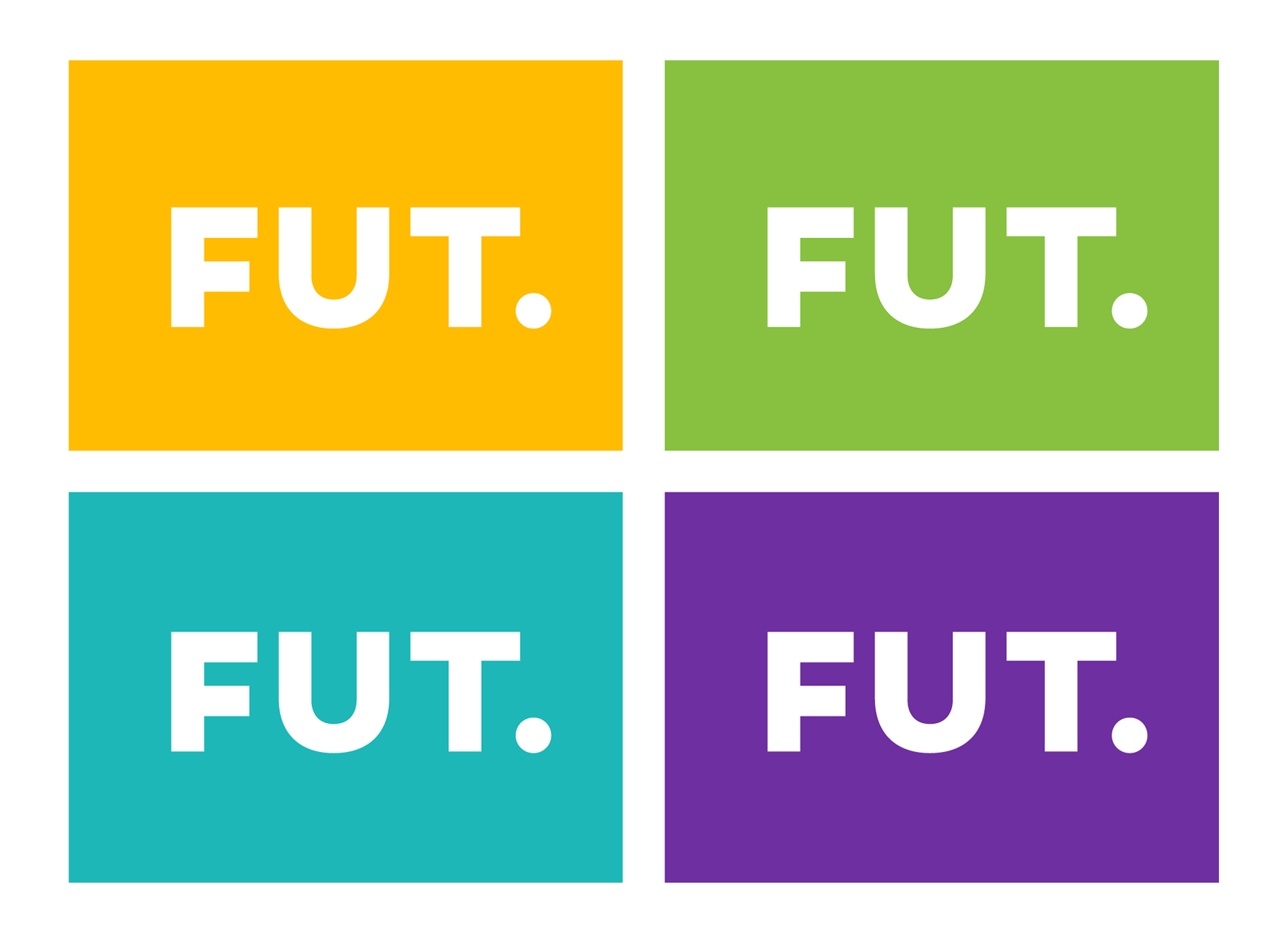
The goal was to radiate joy and diversity through a vibrant/versatile color palette that is perceived as friendly and inclusive to all kinds of people. For the typographic system, a sans serif font was implemented to keep a clean and modern vibe.
A sans-serif uppercase font was selected for maximum impact. The original typeface was refined by increasing letter spacing to achieve a more balanced appearance. Additionally, rounded corners were removed to create a bolder, more commanding presence.


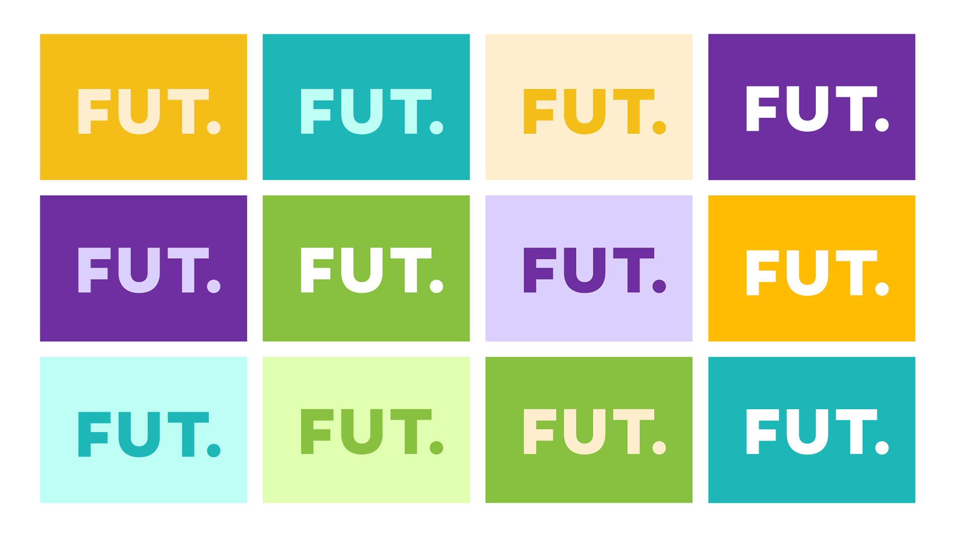
Additionally, a secondary pastel-toned color palette was introduced, derived from the primary colors to enhance contrast. This expansion provides the brand with greater flexibility and a wider range of design possibilities.


The use of overlapping circles in various sizes is a defining element of the brand, adding a sense of movement while reflecting its cheerful and playful personality.